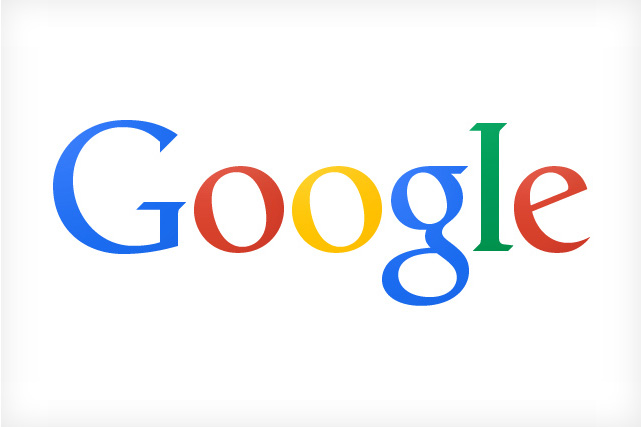
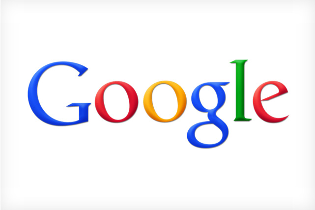
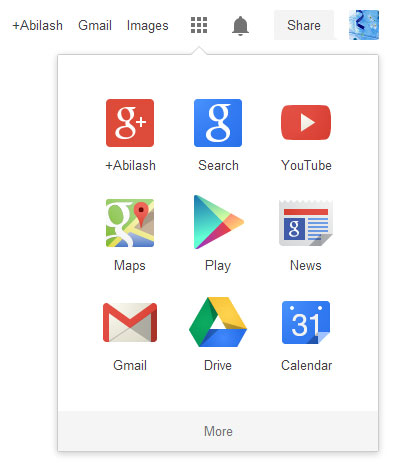
As the trend changes all big companies are keen on pressing their logos and icons flat and Google is no exception. Google today revealed its new logo, this flat design have been in rumors for some days and finally came for real. In addition to its re-designed logo, Google has also removed its black navigation bar and converted it into a grid. Now you can access all your Google apps from the grid (with an extra mouse click!). It will be interesting to see how people react to this change.
Al this moment, you can find this new design on Google.com and we can expect it on other country specific domains like Google.co.uk, Google.co.in soon.





![15+ Best and Must-Have Software for your New PC [2020] 15-Best-and-Must-Have-Software-for-your-New-PC-2020-Edtion](https://thetechgears.com/wp-content/uploads/2019/12/15-Best-and-Must-Have-Software-for-your-New-PC-2020-Edtion-100x70.jpg)

