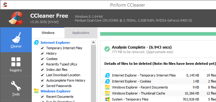
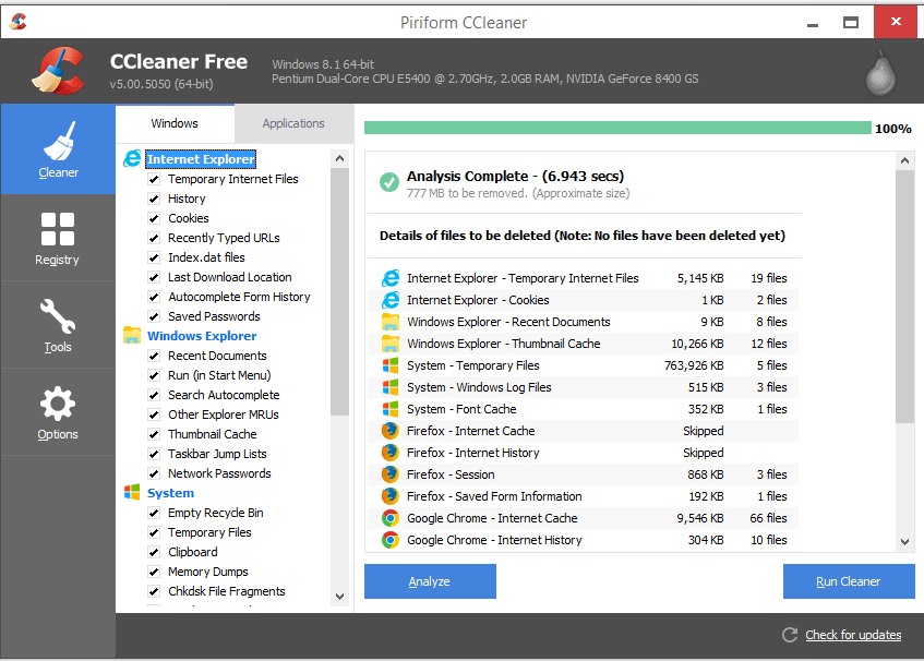
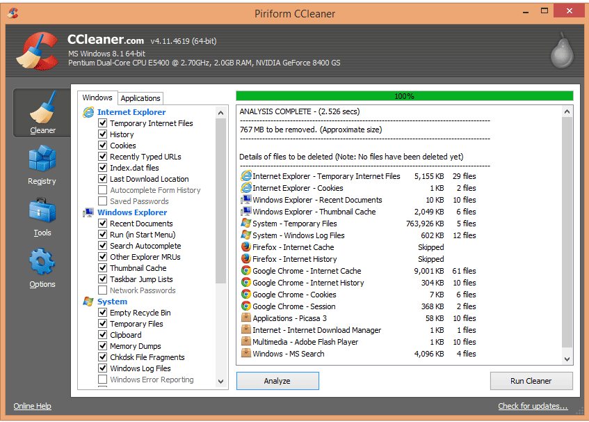
Ccleaner 5.0 is out for download with a new flat design. The new version has got some minor updates under the hood and major update to its user interface. The design seems to follow the latest trend of flat designs. The design emulates the look of Windows 8 and Windows 10 operating systems.
Note that in the recent months, many big tech companies have opted for flat designs, for instance, Microsoft Outlook, Chrome logo, Windows 8 and Windows 10 operating systems, Google logo, Apple icons and so on.
What do think of Flat Design in Ccleaner? Do you think it is attractive and modern or simply an unnecessary change? Let us know in the comments below.
UI Comparison between Ccleaner 5 and 4
Ccleaner 5
Ccleaner 4


![15+ Best and Must-Have Software for your New PC [2020] 15-Best-and-Must-Have-Software-for-your-New-PC-2020-Edtion](https://thetechgears.com/wp-content/uploads/2019/12/15-Best-and-Must-Have-Software-for-your-New-PC-2020-Edtion-100x70.jpg)


